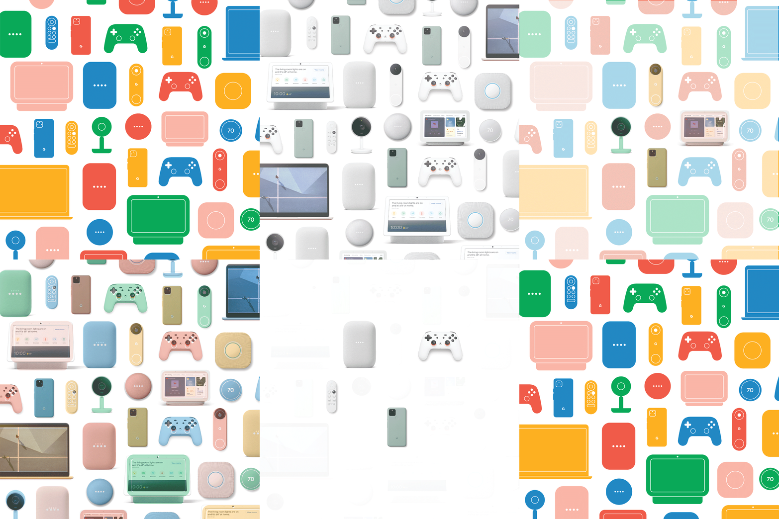
Google: Hardware Pattern
In 2020 love for the Google brand was high, but most consumers still didn’t know that Google makes hardware products. The G logo, primary colors, and lifestyle photography were not quickly communicating devices or how the products work together. Google needed a dynamic graphic solution that celebrated the beautiful hardware design and could be quickly adapted to span across many different touchpoints in markets around the world.
The strategy and design teams decided that a graphic pattern would be an ownable, scalable, cost-effective, and playful solution that would fit in with the Google brand. I had already completed an overhaul of Google’s on-shelf signage to focus on icons earlier that year, so I was brought in to help design the graphic pattern. I worked closely with our Creative Director to honor the vision of the Industrial Design team while also meeting the needs of Retail, Marketing, and Production.
Mock ups of how the pattern could be scaled across signage, merchandise, web design, out of home advertising, and even large-scale projects like a community basketball court.
These GIFs show how the pattern could shift from photography to graphics in animated executions such as web banners or commercials. A few products could be highlighted as the rest fade out in order to support integration storytelling. We also made sure that the graphic could work with multiple colors or a single color if needed for extra flexibility.
We explored many layers of detail both to discover what would work best, but also to ensure a flexible system should we ever need a more or less detailed version for a particular execution.


