Google: Hardware Launch 2021
An example of the 2020 design system, which included a clean white slate and colorful type.
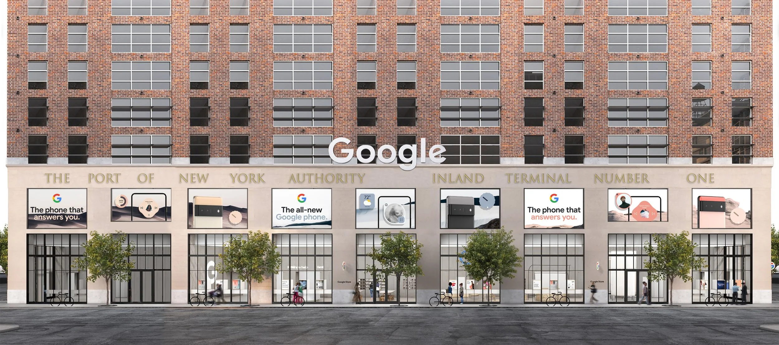
Previous years’ launch graphics built from a clean white slate, with straightforward product photography and friendly, colorful type (right). For 2021, however, Google was launching the first ever phone built entirely from scratch by Google, with an incredible new leap forward in UI that adapted to the user’s wallpaper and preferences, and flowed with natural movement. With such a bold new direction in hardware and software, we needed to come up with something equally innovative and exciting for the retail visual system.
I worked with a cross-functional team to push our brand’s limits and explore a new design system. With the challenges of working remotely and timelines being extra tight due to Covid restrictions, we sprinted in small teams to develop designs based on several potential wallpaper directions that Seed Studio was exploring in conjunction with Google’s UI team. I was the lead designer on concepts based on potential landscape and floral wallpapers, in which I highlighted the flowing adaptability of the UI. In the end we landed on a system of collage visuals that incorporated elements from multiple wallpaper directions, concepted by my teammate Michelle Konar, but I would also like to share my process work here before the final visuals (bottom of page).
Landscape Direction
For this direction I explored how different landscapes could not only reflect the UI, but also flow into each other if multiple graphics were placed together, such as in OOH environments, further developing the feeling of flow and adaptability to individual users.


Floral Direction
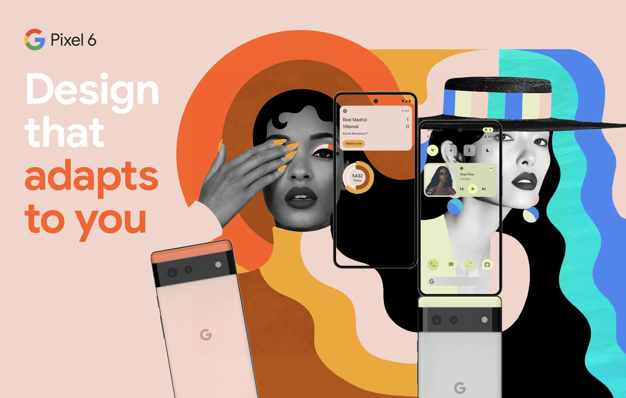
For this direction I focused on vibrant imagery that felt colorful but more premium than the Google primary colors. Both the floral imagery and widgets are bursting out of the phone, illustrating the aliveness of the adaptable UI and the integration of each user’s unique life with their devices.


Lifestyle Direction
This design was an early frontrunner for the target audience for Pixel 6, but was not pursued further as it was too off-brand for the rest of the Google portfolio.
Final Collage Direction
Drawing from multiple wallpaper directions and prior concepts, this final concept allowed us to show both people and wallpaper elements, as well as both the front and back of each device.


